Ever wanted to know how to achieve the perfect makeup flatlay for Instagram? Here are 5 steps on how to do so!

Now, there is no right or wrong way to to do flatlays of makeup but I figure I'd provide some tips and tricks if you're wanting to get into flatlays. Flatlays are a fun way to show off products and their packaging. I personally love doing flatlays more than doing actual makeup looks because they're way more fun for me. Don't get me wrong, I love doing makeup looks but the process of extracting the photos, editing, making the captions, and uploading is just too much for me with my busy schedule. But without any hesitation, let's get into it!
TIP #1: FILLING EMPTY SPACE
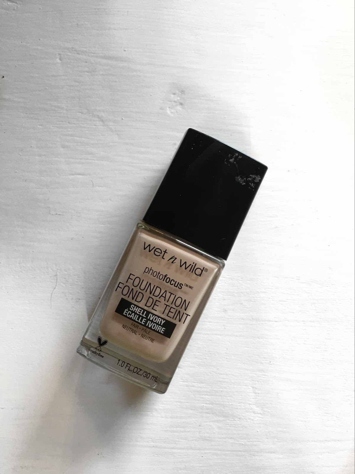
The point of a flatlay is to capture the eye and capture the beauty of the product shown. Empty space (obviously) doesn't attract the eye and make your actually look at the photo.

Though the product above is displayed very neatly, there's so much empty space and blan. You can either bring your camera in the closer to exclude out extra blank space or fill up the space with more products/color. All this brings me into my next point.
TIP #2: FILLING UP BLANK SPACE WITH COLOR/PRODUCTS
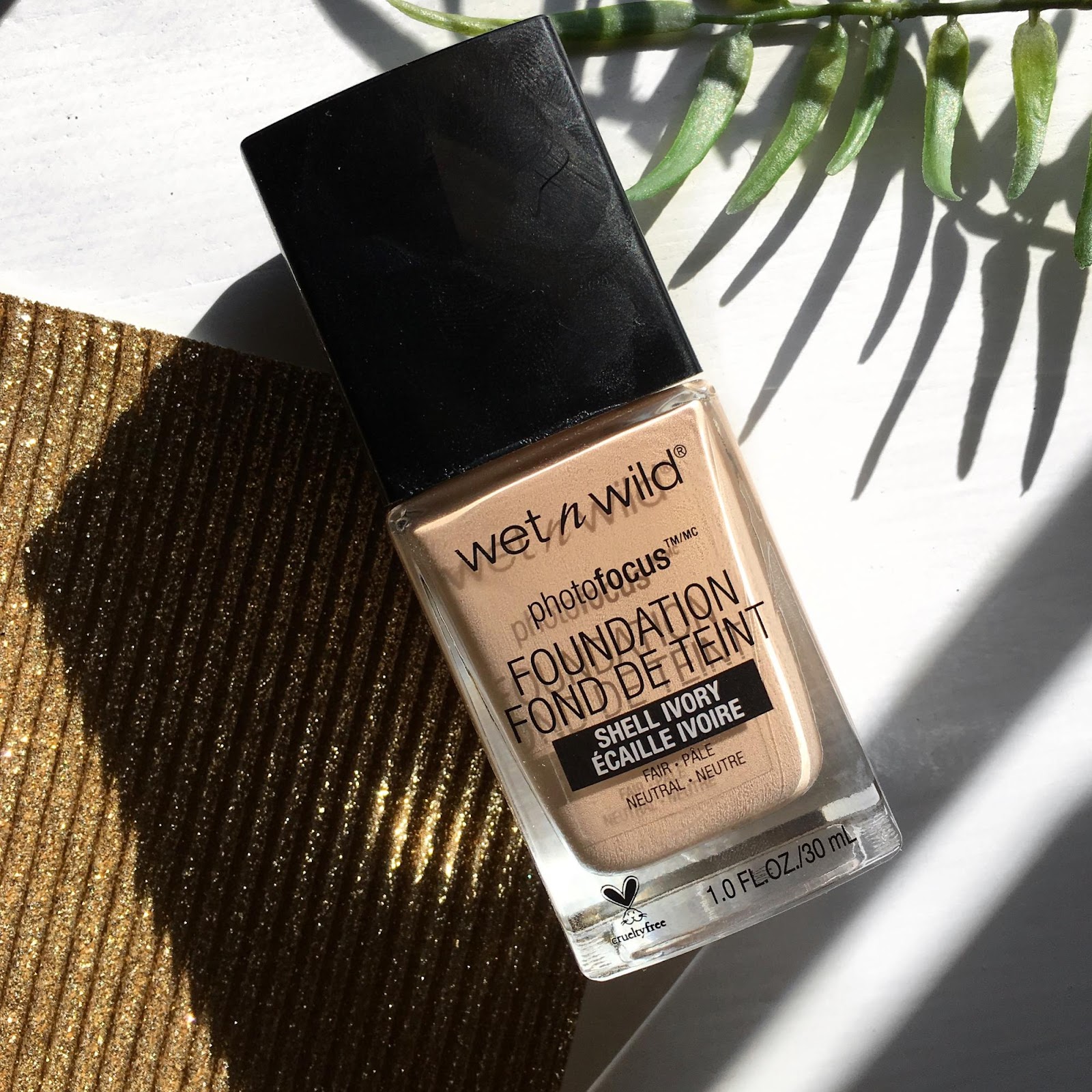
Spice up the blank space with color or more products, or even both if you're really feeling it! I personally like to include faux foliage or some cheap decorative paper. It gives off a more professional look, it includes a new texture in the photo, adds color, and provides lines that attract the eye if needed.

The photo above provides a perfect example of including texture and lines to a blank space. I didn't include color with this photo because I want the foundations to pop in the photo. I got these papers at Hobby Lobby for like $0.85 each, making it a relatively inexpensive way to achieve a more lux photo. Gold papers, silvers, and greys look best and are quite universal. I would avoid very dark papers, as they absorb light but do work well to contrast products with lighter colored packaging. If I were to purchase a darker colored paper, I'd get something with glitter or something with 2 different textures (matte + shiny, matte + satin,..).
TIP #3: SATURATION
Color is so important when attempting to catch the eye of someone frantically scrolling through their Instagram feed. Dull colors don't enhance the quality of your photos and aren't as attractive.

A lot of the process saturating photos is in editing. I use a white table to shoot on and sometimes the lighting makes my table look super yellow. How I combat that yellowness is with an app called FaceTune. Yes, you do have to pay for it but it's so worth it. Removing the yellow hues off my table doesn't combat with the product I am photographing. Once the photo is whitened, I edit the brightness, up the contrast, sharpen, and saturate the photo all on Instagram. The photo above displays the final product, with a little help from natural lighting of course.
Using tip #2, I enhance the colors even more with a glittery silver paper that doesn't compete with the colors in the Anastasia palette. I filled the space effectively without making it too busy and I honestly love this photo.
TIP #4: LINES
Again, the purpose of a flatlay is to capture the eye and show off the product. Lines are important when you really want to incorporate space between multiple products. Lines can also be important for contrast the "flow" of the product.

The photo above is perfect example of contrasting the flow of the photo using the silver sparkly paper. Doing this makes the product just pop out even more. Aligning the product with paper looks very blah and doesn't give off a decent flow to catch the eye.
But as I mentioned before, if you want to create separation amongst your products, lines really do help.

Keeping it pretty symmetrical in the photo above, I spaced out these products as evenly as possible to create the oh-so-magical flow that I keep talking about in this tip. I also kept these products within the same kind of peachy/pink family to keep it unison with one another. I personally keep the separation amongst products fairly similar for coherence and to keep the flow going!
TIP #5: NATURAL LIGHTING IS A WONDERFUL THING
It's amazing the power that natural light holds over a flash. Don't get me wrong, I love super lux, glamorous flash flatlays like the next beauty junkie but oh my goodness, I love natural lighting in my photos!

Natural lighting just gives off nice shadows on the occasion. Sometimes shadows can be your enemy but if you finesse it just right, shadows can provide a way to fill up space or draw attention to the light. Shadows make great photographs, whether you're photographing a flatlay or yourself. Natural lighting also saves some cash by not investing in a ring light if you're not into flash photography.
I've also noticed, I don't have to edit as much when taking photos in natural daylight, the sun just does it for me. I photograph all my flatlays on Saturday and Sunday to catch the sun rising on the side of my house where my beauty room is to get the ideal amount of natural lighting (sounds crazy but looks so good). For me, switching to natural lighting was perfect for me. It might not be everyone's thing but it definitely adds better shadows and less editing = less graininess, low quality photos.
THE FINAL PRODUCT WHEN INCLUDING ALL THESE STEPS..
Look at that, same product, same table I photographed on, but two totally different photos! Incorporating the steps mentioned above, here's the final product! Also, for Instagram's sake, I keep all my photos on a 4x4 ratio (square) to fit on my feed, also a pretty good tip if you're into doing your own flatlays!
TIP #4: LINES
Again, the purpose of a flatlay is to capture the eye and show off the product. Lines are important when you really want to incorporate space between multiple products. Lines can also be important for contrast the "flow" of the product.
The photo above is perfect example of contrasting the flow of the photo using the silver sparkly paper. Doing this makes the product just pop out even more. Aligning the product with paper looks very blah and doesn't give off a decent flow to catch the eye.
But as I mentioned before, if you want to create separation amongst your products, lines really do help.
Keeping it pretty symmetrical in the photo above, I spaced out these products as evenly as possible to create the oh-so-magical flow that I keep talking about in this tip. I also kept these products within the same kind of peachy/pink family to keep it unison with one another. I personally keep the separation amongst products fairly similar for coherence and to keep the flow going!
TIP #5: NATURAL LIGHTING IS A WONDERFUL THING
It's amazing the power that natural light holds over a flash. Don't get me wrong, I love super lux, glamorous flash flatlays like the next beauty junkie but oh my goodness, I love natural lighting in my photos!
Natural lighting just gives off nice shadows on the occasion. Sometimes shadows can be your enemy but if you finesse it just right, shadows can provide a way to fill up space or draw attention to the light. Shadows make great photographs, whether you're photographing a flatlay or yourself. Natural lighting also saves some cash by not investing in a ring light if you're not into flash photography.
I've also noticed, I don't have to edit as much when taking photos in natural daylight, the sun just does it for me. I photograph all my flatlays on Saturday and Sunday to catch the sun rising on the side of my house where my beauty room is to get the ideal amount of natural lighting (sounds crazy but looks so good). For me, switching to natural lighting was perfect for me. It might not be everyone's thing but it definitely adds better shadows and less editing = less graininess, low quality photos.
THE FINAL PRODUCT WHEN INCLUDING ALL THESE STEPS..
Look at that, same product, same table I photographed on, but two totally different photos! Incorporating the steps mentioned above, here's the final product! Also, for Instagram's sake, I keep all my photos on a 4x4 ratio (square) to fit on my feed, also a pretty good tip if you're into doing your own flatlays!
Be sure to subscribe to my blog, you will receive an email notification every time I post to my blog!
Instagram: @glammunition and @glammunition.lnl (and turn on post notifications so you never miss a post)
Facebook: @glammunitionn
Question of the Post: Are you into makeup flatlays/aesthetically pleasing makeup collections?
♛
Comments
Post a Comment